Very light movement over the Garden State last night, but some interesting lessons in radar interpretation could be had by viewing the velocity plot in conjunction with the base reflectivity. First here’s the radar loop (starting at 10:00pm, in clear-air mode):
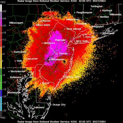
Notice a big radar signal in the western part of the state. Without the aid of any other data, the origin of this signal could easily be misinterpreted as bird migration.
Here’s a single base reflectivity image from 10:44pm, but in precip mode (due to my different sources of data, not for any analytical reason):
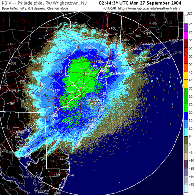
Again, you can see the large area I’m referring to, now in green.
Now here’s the velocity plot for the same time:
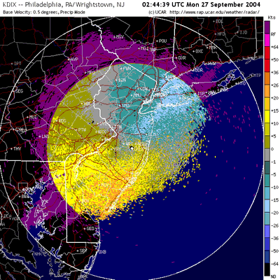
Here we can see some north –> south movement, but it’s mostly concentrated along the coast. What we do see in the western portion of the state is a large area of zero-velocity (gray).
In an attempt to illustrate this point, I’ve created a composite image where I’ve blocked out the zero-velocity area and replaced it with the data from the base reflectivity image. You can see it here:
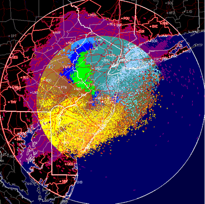
What this shows us is that the strong signal from last night is mostly of zero-velocity, a characteristic of anomalous propagation resulting from temperature inversion after sunset.
3 responses to “Little Migration Over NJ”
But, are you saying the base reflectivity image is showing a false picture of active mgration? Why did you replace the zero migration with the base reflectivity? Does it show that the bright green of the (precip mode) matches exactly to the grey of the zero velocity?
And I don’t understand the velocity plot. I don’t see just grey, I see yellow and greenish yellow, actually more than the grey. What do they mean?
Thanks for trying to put some tutorials up!
Susan
David,
My questions were going to be the same as Susans especially about the area of zero velocity. By the way…nice site, I visit it often.
Jamie
Reading the velocity plot:
This plot shows movement through the radar’s view. In this case, the movement looks to be from the N/NE (blues), over the radar, and then out to the S/SW (yellows/oranges). The “stuff” coming into the radar has a negative value (again, the blues) and the “stuff” going away from the radar has a positive value (again, the yellows/oranges). That’s how you would read the plot, “stuff “ is entering from the blue area, and heading in the direction of the yellow area. Areas of zero velocity are in gray, and areas of very low velocity are that dark yellow/green color and the dark teal (my brain’s color wheel is pretty minimal).
Using velocity to interpret the radar:
Most bird migration occurs at a velocity 10 – 20kts greater than the prevailing winds. In this case, most of the base reflectivity (radar) signal is occurring in an area with either zero, or very little velocity. Therefore I interpret this as anomalous propagation, a signal caused by temperature inversion after sunset (there’s a link to a paper under the radar study links). It might have been a little confusing since I only blocked out the zero-velocity area, but I was trying to be conservative. I would suspect that that entire large signal in the west/central area was caused by anomalous propagation, and that the only migration picked up in the radar was the stuff near the coast. I hope this helps.
Cheers